Bringing clarity to patient transport when it matters
Ambuce Rescue Team
UX/UI Design
Content Creation
Context
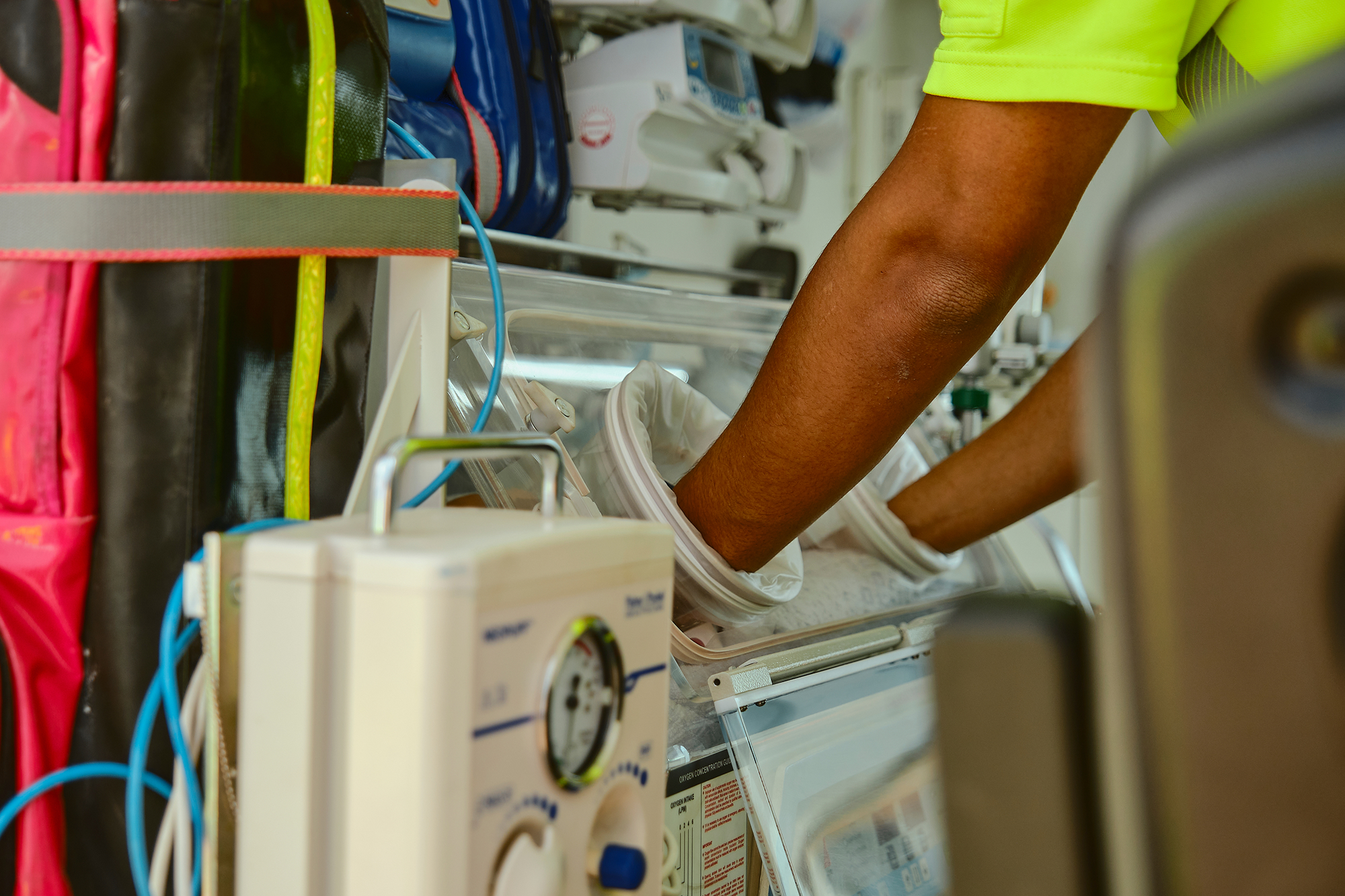
Ambuce Rescue Team is the Belgian market leader in urgent and non-urgent patient transport. But their digital presence didn’t reflect that position. The website lacked clarity, authority, and a clear explanation of what they actually do. For an organization built on trust and expertise, that gap mattered.
Design
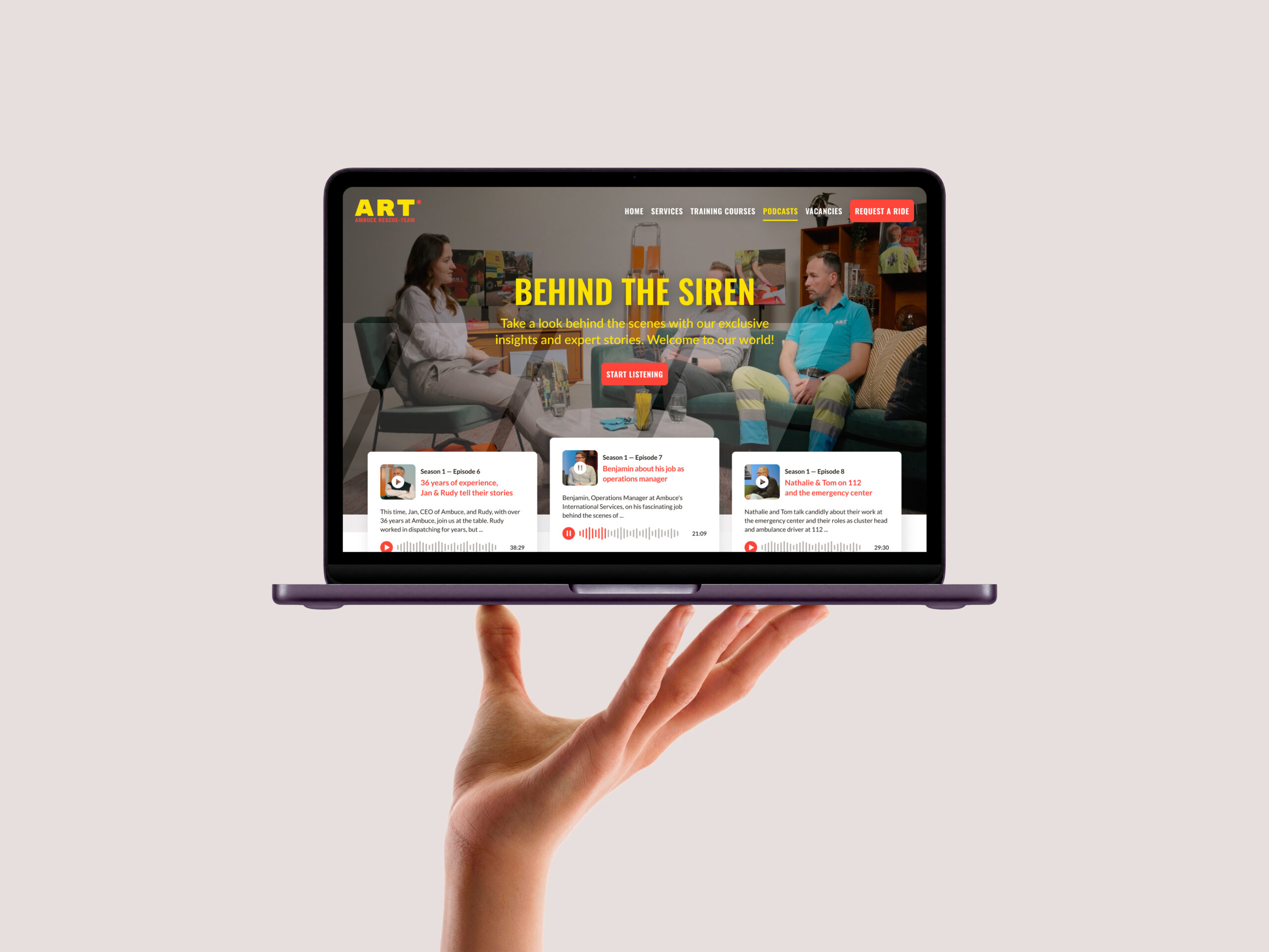
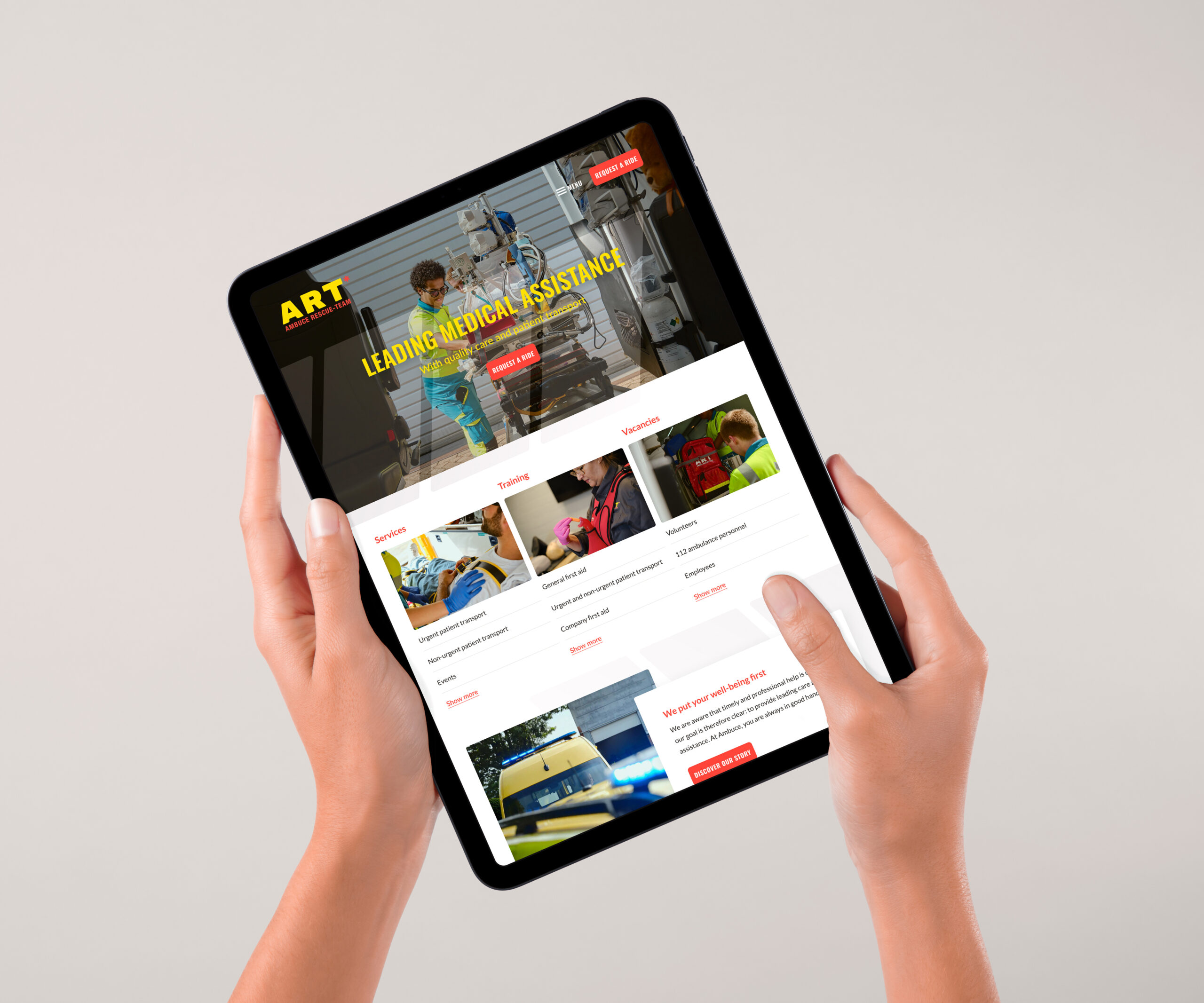
We started with a workshop to uncover where the previous experience fell short. Where people got lost, what felt unclear, and what needed to change. From there, we created a narrative that explains Ambuce’s services without ambiguity, supported by a structure that guides different audiences quickly to the right information. Their position as a trusted leader in patient transport became more explicit, while the training centre was introduced as a natural extension of their expertise.
Results
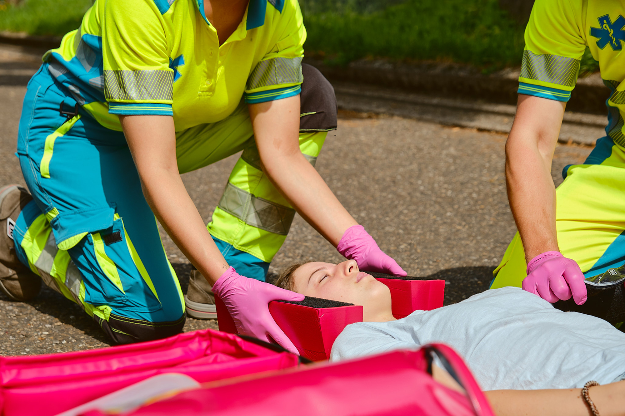
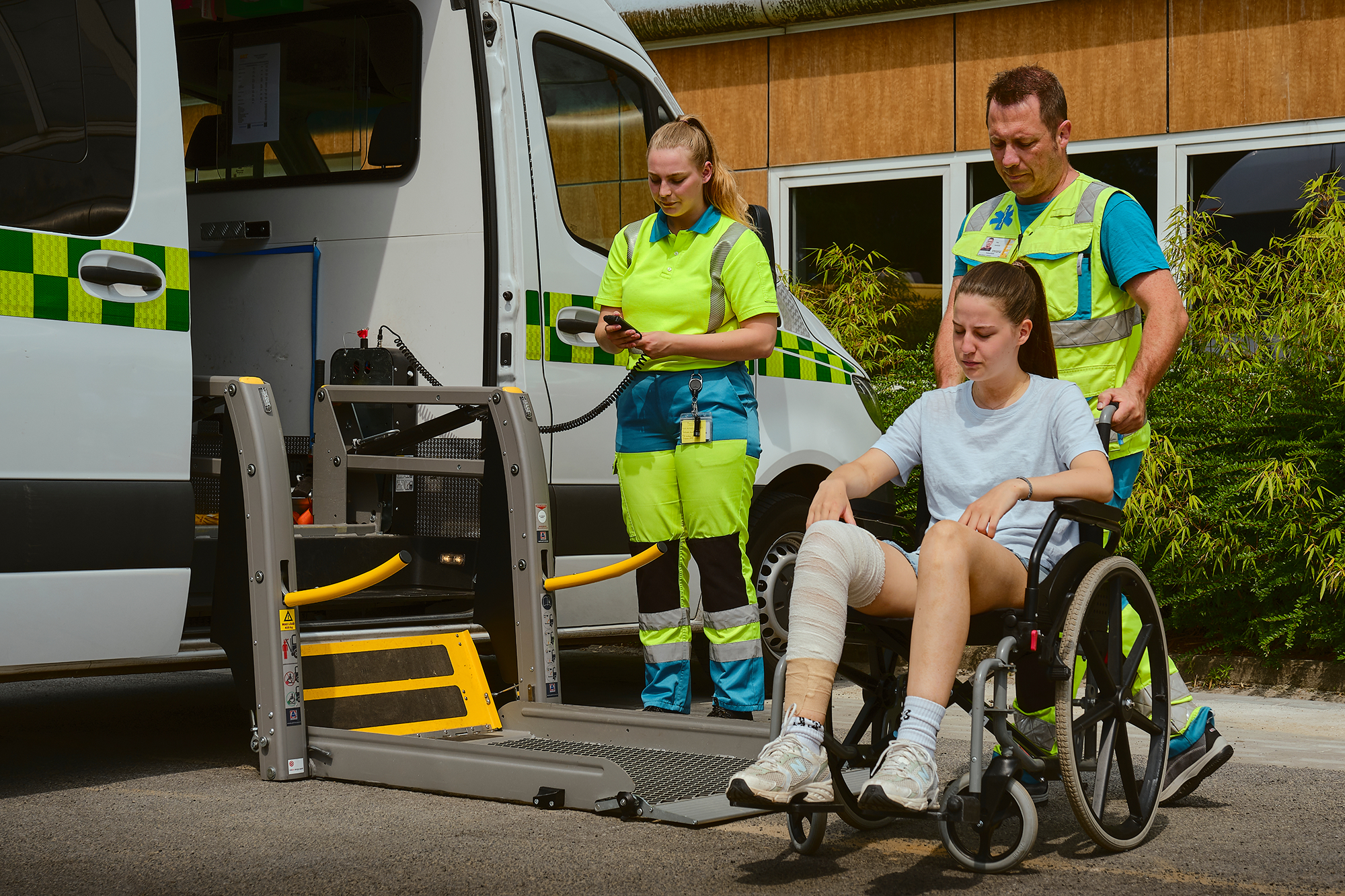
Supported by a new set of on-location visuals, created to reflect the reality of their work. Professional, human, and present in the moments that matter. Everything was designed to feel reliable, professional, and easy to navigate. Especially in moments where clarity matters most.
A digital presence that matches Ambuce’s role in the market. Stronger positioning. Clearer communication. An experience that builds trust from the first interaction. Because clarity makes things work for humans.